Brand Resource Center
Brand Resources
Veeam Logos
Choose from multiple variations of Veeam’s official logo and download the best match for your project requirements while ensuring your use of our brand logo is accurate and up to date.

Veeam’s Color Palette
Download this guide for access to examples and information of Veeam’s official color palette, including hexadecimal and CMYK codes.
#00D15F
CMYK 71 0 84 0
Pantone 2420 C
#000000
CMYK 30 30 30 100
Pantone Black 6 C
#FFFFFF
CMYK 0 0 0 0
#9CFFA3
CMYK 31 0 34 0
Pantone 2254 C
#32F26F
CMYK 54 0 65 0
Pantone 2268 C
#007F49
CMYK 85 8 88 25
Pantone 6181 C
#505861
CMYK 63 52 44 33
Pantone Cool Gray 11 C
#ADACAF
CMYK 28 21 18 0
Pantone Cool Gray 11 C
#F0F0F0
CMYK 0 0 0 6
Pantone Cool Gray 1 C
#FFD839
CMYK 0 4 88 0
Pantone 115 C
#FE8A25
CMYK 0 50 100 0
Pantone 151 C
#8e71f4
CMYK 49 55 0 0
Pantone 2655 C
#3700FF
CMYK 92 97 0 0
Pantone 2098 C
#57E0FF
CMYK 55 0 0 0
Pantone 305 C
#ED2B3D
CMYK 0 93 82 0
Pantone 1788 C
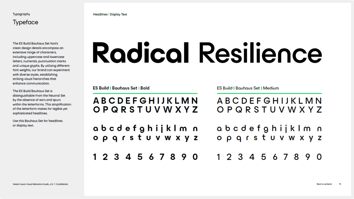
Veeam’s Official Font
Click here to request Veeam’s official font, ES Build, via email. Include your agency name and contact details in the email. We will respond with instructions on installing, finding, and using the font on both Windows and MacOS platforms. For our brand editorial style guide, click here.
Veeam Logo Animations
Access Veeam’s animated logos for use in Veeam-branded video projects and add the perfect touch of our brand energy to your content.

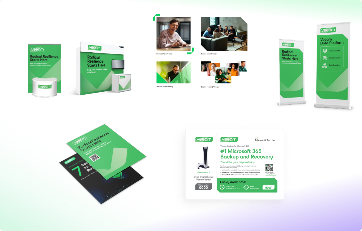
All-in-One Resource Bundle
Packed with essential Veeam resources, this bundle is a one-stop shop of Veeam’s media resources, including our brand guidelines, logo packages, brand videos, and more.
About Veeam
Our mission and leadership
Resources
What’s new
Media Contacts
Heidi Monroe Kroft
Director, Corporate Communications and Global Public Relations
+1 614 339 8200 | @hmonroekroft | heidi.kroft@veeam.com
Rachel Kaltenbach
Global Analyst Relations Director
+1 614 937 7590 | Office: +1 614 547 4296 | rachel.kaltenbach@veeam.com
Zeljka Skoko
Manager, Corporate Communications, EMEA
+49(0)1573 / 43 88 355 | zeljka.skoko@veeam.com
Jessica Munoz
Global Analyst Relations Manager
+1 347 724 6049 | Jessica.Munoz@veeam.com
Radical Resilience Starts Here
hybrid cloud and the confidence you need for long-term success.
Learn the Latest Trends in Data Protection
Our 5th annual report summarizing data protection strategies
View a Demo
Learn what it takes to become radically resilient — and to keep your business running
